
jeremykenedy / laravel-toast

Multi-framework toast notifications for Laravel with Tailwind, Bootstrap 5, Bootstrap 4, Blade, Livewire, Vue, React, and Svelte support.
Requires
- php: ^8.2
- illuminate/broadcasting: ^10.0|^11.0|^12.0|^13.0
- illuminate/support: ^10.0|^11.0|^12.0|^13.0
- illuminate/view: ^10.0|^11.0|^12.0|^13.0
Requires (Dev)
- laravel/pint: ^1.0
- livewire/livewire: ^3.0|^4.0
- orchestra/testbench: ^8.0|^9.0|^10.0|^11.0
- pestphp/pest: ^2.0|^3.0|^4.0
- pestphp/pest-plugin-laravel: ^2.0|^3.0|^4.0
Suggests
None
Provides
None
Conflicts
None
Replaces
None
- dev-main
- v3.1.0
- v3.0.1
- v3.0.0
- v2.0.0
- v1.0.0
- v0.5.0
- dev-update-changelog-for-v3-1-0
- dev-clear-remaining-codacy-findings
- dev-imgbot
- dev-add-notification-settings-color-picker
- dev-fix-frontend-dependency-compatibility
- dev-docs-readme-screenshots-and-file-tree
- dev-fix-toast-behavior-and-framework-support
- dev-analysis-DDoB69
- dev-analysis-nKv1g5
- dev-analysis-42aoQP
This package is auto-updated.
Last update: 2026-10-20 21:31:24 UTC
README
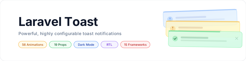
Toast notifications for Laravel with five frontends, three CSS frameworks, 49 animations, and private broadcasts.

Table of Contents
- Framework Support
- Screenshots
- Requirements
- Installation
- Quick Start
- Features
- Configuration
- Animations
- Styles and Dark Mode
- Notification Settings
- Usage
- Changing Frameworks
- Artisan Commands
- Testing
- Documentation
- File Tree
- Contributing
- Changelog
- License
Framework Support
| CSS framework | Blade + Alpine.js | Livewire 3 / 4 | Vue 3 | React 18 | Svelte 4 / 5 |
|---|---|---|---|---|---|
| Tailwind v4 | Yes | Yes | Yes | Yes | Yes |
| Bootstrap 5.2+ | Yes | Yes | Yes | Yes | Yes |
| Bootstrap 4 | Yes | Yes | Yes | Yes | Yes |
Every pairing ships framework-appropriate colors and supports the same toast payload. JavaScript components select their classes from the payload's css_framework, or from an explicit cssFramework prop.
Screenshots
The React container renders success, error, warning, and info notifications below using each supported CSS framework. Screenshots show the package's default colors in light and dark mode, with auto-dismiss disabled. Select an image to view it at full size.
| CSS framework | Light mode | Dark mode |
|---|---|---|
| Tailwind v4 |  |
 |
| Bootstrap 5.2+ |  |
 |
| Bootstrap 4 |  |
 |
To refresh these screenshots from the actual components, install the development dependencies and Chromium, then run:
npm ci
npx playwright install chromium
npm run screenshots
Settings Page
Captured from the settings page running in a Laravel application, with light and dark mode edited for the success and info types and every other color left on Default. The first image in each pair is the color pickers, the second is the live preview. Select an image to view it at full size.


Requirements
- PHP 8.2+
- Laravel 10, 11, 12, or 13
- Tailwind v4, Bootstrap 5.2+, or Bootstrap 4 CSS
- Alpine.js for Tailwind Blade; Livewire 3 or 4 for the Livewire container; or Vue 3, React 18, or Svelte 4 / 5
- Laravel broadcasting, a queue worker, and Laravel Echo for optional real-time delivery
- A database table, only if you enable the optional notification settings
Bootstrap Blade toasts work without jQuery or the Bootstrap JavaScript bundle. CI selects Laravel 10 through 13 and both supported Livewire majors.
Installation
composer require jeremykenedy/laravel-toast
php artisan toast:install
The installer publishes config/toast.php and records your framework choices in .env. If configuration already exists, it detects the installation and asks before reinstalling. Use toast:update or toast:switch to preserve customized configuration. --force permits reinstalling and replacing the configuration; published views are retained.
Tailwind Setup
Register the package templates and components in resources/css/app.css:
@import "tailwindcss";
@source "../../vendor/jeremykenedy/laravel-toast/resources";
Tailwind does not automatically scan ignored dependency directories. Keep your application's other imports and sources, and run npm run build after adding this source.
For Tailwind Blade, load Alpine.js once in your application. If it is not already installed:
npm install alpinejs
import Alpine from 'alpinejs'

window.Alpine = Alpine
Alpine.start()
Livewire provides its own Alpine instance. Do not start a second instance in a Livewire application.
Bootstrap Setup
Load the selected Bootstrap stylesheet in your application and choose the matching toast framework:
php artisan toast:switch --css=bootstrap5
npm run build
Livewire Setup
If Livewire is not already installed:
composer require livewire/livewire
Use the Livewire container shown below and follow Livewire's normal application asset setup.
Quick Start
Create notifications with the helper or facade:
use Jeremykenedy\LaravelToast\Facades\Toast;

toast('Settings saved.');
toast('Upload failed.', 'error', 'Error');
Toast::warning('Low storage.', duration: 3000);
Toast::success('Step 1 done.')->info('Starting step 2.');
Blade
Place the directive before </body> in your layout:
@toasts
@include('toast::toasts') is equivalent. Standard string flash messages are converted automatically and shown once:
return back()->with('success', 'Profile updated.');
Livewire
<livewire:toast-container />
From another Livewire component:
$this->dispatch('toast', message: 'Saved!', type: 'success');
$this->dispatch('toast-error', message: 'Upload failed.');
Sharing Toasts with Inertia
Share the payload on each response from your Inertia middleware's share() method:
use Jeremykenedy\LaravelToast\Facades\Toast;

return array_merge(parent::share($request), [
    'toasts' => function () {
        if (config('toast.convert_flash', true)) {
            Toast::convertFlashMessages();
        }

        return Toast::get();
    },
]);
Mount one container in your layout. The examples below assume that the layout file lives in resources/js/Layouts/; adjust the relative import if needed. Updated initialToasts arrays enqueue new IDs without replaying dismissed messages.
Vue
<script setup>
import ToastContainer from '../../../vendor/jeremykenedy/laravel-toast/resources/js/vue/pages/ToastContainer.vue'

defineProps({ toasts: { type: Array, default: () => [] } })
</script>

<template>
    <slot />
    <ToastContainer :initial-toasts="toasts" />
</template>
React
import ToastContainer from '../../../vendor/jeremykenedy/laravel-toast/resources/js/react/pages/ToastContainer.jsx'

export default function AppLayout({ children, toasts = [] }) {
    return <>{children}<ToastContainer initialToasts={toasts} /></>
}
Svelte
<script>
    import ToastContainer from '../../../vendor/jeremykenedy/laravel-toast/resources/js/svelte/pages/ToastContainer.svelte'
    export let toasts = []
</script>

<slot />
<ToastContainer initialToasts={toasts} />
The JavaScript containers also accept window.__toasts as an initial fallback:
<script>
    window.__toasts = {{ Illuminate\Support\Js::from(Toast::get()) }};
</script>
Later updates should use initialToasts or a broadcast subscription. Changing window.__toasts after mounting does not enqueue notifications.
Features
- Four notification types with optional titles and custom SVG icons
- All 15 CSS/frontend combinations, including Bootstrap JavaScript components
- Reactive SPA notifications with ID deduplication and bounded visible stacks
- Global defaults and per-toast options
- Enter and exit animations, reduced-motion support, and manual dismissal
- Hover and keyboard-focus pause, progress bars, RTL, and dark mode
- Session flash conversion and optional private broadcasts
- Translations for 42 locales and a
dismissLabelprop for JavaScript frontends - Optional settings page with color pickers, live light and dark previews, and every behavior option, saved to your database and available for Blade, Livewire, Vue, React and Svelte in all three CSS frameworks
Configuration
php artisan vendor:publish --tag=toast-config
All environment settings are optional. Configure them in your application's .env or edit the published configuration. When configuration is cached, run php artisan config:cache after changing environment values.
| Config key | Environment variable | Default |
|---|---|---|
css_framework |
TOAST_CSS |
null, defers to ui-kit or Tailwind |
frontend |
TOAST_FRONTEND |
null, defers to ui-kit or Blade |
position |
TOAST_POSITION |
top-right |
dir |
TOAST_DIR |
ltr |
duration |
TOAST_DURATION |
5000 milliseconds |
max_visible |
TOAST_MAX_VISIBLE |
5; nonpositive means unlimited |
auto_dismiss |
TOAST_AUTO_DISMISS |
true |
pause_on_hover |
TOAST_PAUSE_ON_HOVER |
true |
stack |
TOAST_STACK |
true |
show_icons |
TOAST_SHOW_ICONS |
true |
show_border |
TOAST_SHOW_BORDER |
true |
show_close |
TOAST_SHOW_CLOSE |
true |
show_progress |
TOAST_SHOW_PROGRESS |
true |
progress_direction |
TOAST_PROGRESS_DIRECTION |
rtl |
progress_position |
TOAST_PROGRESS_POSITION |
top |
opacity |
TOAST_OPACITY |
1 |
enter_animation |
TOAST_ENTER_ANIMATION |
none |
enter_duration |
TOAST_ENTER_DURATION |
0.5 seconds |
exit_animation |
TOAST_EXIT_ANIMATION |
none |
exit_duration |
TOAST_EXIT_DURATION |
0.5 seconds |
broadcast.enabled |
TOAST_BROADCAST_ENABLED |
false |
broadcast.channel |
TOAST_BROADCAST_CHANNEL |
toast.{userId} |
colors |
Config only | [], per type, mode and part hex overrides |
settings.* |
TOAST_SETTINGS_* |
Disabled; see docs/settings.md |
session_key |
Config only | toast_notifications |
convert_flash |
Config only | true |
TOAST_FRONTEND records the setup for Artisan commands. Your layout decides which frontend renders. TOAST_CSS selects Blade/Livewire views and supplies the JavaScript payload's CSS framework.
When laravel-ui-kit is installed and toast has no explicit override, commands update UI_KIT_CSS and UI_KIT_FRONTEND. An existing TOAST_CSS or TOAST_FRONTEND override is updated directly, so the command changes the setting that actually controls toast. Clear those overrides to resume following the kit.
Per-Toast Options
| Option | Default | Values |
|---|---|---|
position |
Global position | top-left, top-center, top-right, bottom-left, bottom-center, bottom-right |
dir |
ltr |
ltr, rtl |
auto_dismiss |
true |
Boolean |
pause_on_hover |
true |
Boolean; also pauses while focus is inside the toast |
stack |
true |
false replaces the entire current list across positions |
max_visible |
5 |
Positive integer cap; nonpositive means unlimited |
show_icon |
Global show_icons |
Boolean |
custom_icon |
null |
Trusted SVG HTML supplied by your application |
show_border |
true |
Boolean |
show_close |
true |
Boolean |
show_progress |
true |
Boolean |
progress_direction |
rtl |
rtl, ltr |
progress_position |
top |
top, bottom |
opacity |
1 |
Number from 0 to 1 |
enter_animation |
none |
Animation name below |
enter_duration |
0.5 |
Seconds |
exit_animation |
none |
Animation name below |
exit_duration |
0.5 |
Seconds |
duration is a separate method argument in milliseconds; 0 keeps the toast until manual dismissal. Configuration-only settings such as broadcasting and session storage are not per-toast options.
toast()->success('Saved!', 'Done', 3000, [
    'position' => 'bottom-right',
    'dir' => 'rtl',
    'stack' => false,
    'show_border' => false,
    'enter_animation' => 'slide-right',
    'exit_animation' => 'fade',
    'progress_position' => 'bottom',
]);
JavaScript Container Props
| Prop | Purpose |
|---|---|
initialToasts |
Initial and subsequent arrays of payloads; unseen IDs are enqueued |
position |
Fallback for legacy payloads without a position |
stack |
Optional container override; otherwise honors each payload |
cssFramework |
Optional tailwind, bootstrap5, or bootstrap4 override |
dismissLabel |
Translated close-button label; defaults to Dismiss |
echo |
Optional Laravel Echo instance; defaults to window.Echo |
channel |
Private channel name without the private- prefix |
Animations
49 animation styles, plus none, available for both enter_animation and exit_animation.
Every style ships an enter and an exit keyframe, and all of them work in every
CSS framework and frontend.
Directionless names (e.g., slide, bounce) use a sensible default (typically center or right):
| Style | Enter | Exit |
|---|---|---|
none |
Instant appear | Instant remove |
| Fade | ||
fade |
Fade in | Fade out |
fade-center |
Fade in (alias) | Fade out (alias) |
| Slide | ||
slide |
Slide in from right (default) | Slide out to right (default) |
slide-left |
Slide in from left | Slide out to left |
slide-right |
Slide in from right | Slide out to right |
slide-top |
Slide in from top | Slide out to top |
slide-bottom |
Slide in from bottom | Slide out to bottom |
| Bounce | ||
bounce |
Scale up, overshoot, settle (default) | Scale up, overshoot, shrink (default) |
bounce-left |
Overshoot from left then settle | Bounce right then exit left |
bounce-right |
Overshoot from right then settle | Bounce left then exit right |
bounce-top |
Overshoot from top then settle | Bounce down then exit top |
bounce-bottom |
Overshoot from bottom then settle | Bounce up then exit bottom |
bounce-center |
Scale up, overshoot, settle | Scale up, overshoot, shrink |
| Shrink | ||
shrink |
Scale up from center (default) | Scale down to center (default) |
shrink-left |
Expand from right edge | Collapse toward right edge |
shrink-right |
Expand from left edge | Collapse toward left edge |
shrink-top |
Expand from bottom edge | Collapse toward bottom edge |
shrink-bottom |
Expand from top edge | Collapse toward top edge |
shrink-center |
Scale up from center | Scale down to center |
| Flip (3D) | ||
flip |
Flip in 180 Y-axis (default) | Flip out 180 Y-axis (default) |
flip-left |
Flip in from right (Y-axis) | Flip out to left (Y-axis) |
flip-right |
Flip in from left (Y-axis) | Flip out to right (Y-axis) |
flip-top |
Flip in from bottom (X-axis) | Flip out to top (X-axis) |
flip-bottom |
Flip in from top (X-axis) | Flip out to bottom (X-axis) |
flip-center |
Flip in 180 (Y-axis) | Flip out 180 (Y-axis) |
| Spin | ||
spin |
Spin in + scale up (default) | Spin out + scale down (default) |
spin-left |
Spin in from left | Spin out to left |
spin-right |
Spin in from right | Spin out to right |
spin-top |
Spin in from top | Spin out to top |
spin-bottom |
Spin in from bottom | Spin out to bottom |
spin-center |
Spin in + scale up | Spin out + scale down |
| Grow | ||
grow |
Scale up from center (default) | Scale down to center (default) |
grow-left |
Scale up from right edge | Scale down toward right edge |
grow-right |
Scale up from left edge | Scale down toward left edge |
grow-top |
Scale up from bottom edge | Scale down toward bottom edge |
grow-bottom |
Scale up from top edge | Scale down toward top edge |
grow-center |
Scale up from center | Scale down to center |
| Slam (overshoot) | ||
slam |
Scale from 0, overshoot 120%, settle (default) | Overshoot 115%, scale to 0 (default) |
slam-left |
Fly in from left, overshoot 115%, settle | Overshoot 115%, fly out left |
slam-right |
Fly in from right, overshoot 115%, settle | Overshoot 115%, fly out right |
slam-top |
Fly in from top, overshoot 115%, settle | Overshoot 115%, fly out top |
slam-bottom |
Fly in from bottom, overshoot 115%, settle | Overshoot 115%, fly out bottom |
slam-center |
Scale from 0, overshoot 120%, settle | Overshoot 115%, scale to 0 |
| Wobble | ||
wobble |
Wobble side-to-side then appear (default) | Wobble side-to-side then disappear |
wobble-left |
Wobble in from left | Wobble then exit left |
wobble-right |
Wobble in from right | Wobble then exit right |
wobble-top |
Wobble in from top | Wobble then exit top |
wobble-bottom |
Wobble in from bottom | Wobble then exit bottom |
wobble-center |
Wobble + scale up from center | Wobble + scale down to center |
Enter and exit animations have independent duration controls (enter_duration, exit_duration).
Styles and Dark Mode
Blade and Livewire inline the package keyframes and the selected Bootstrap theme. JavaScript components import the shared animation, theme, and layout styles themselves. Importing components directly from vendor/ keeps those relative imports intact. If you copy a component into your application, update its stylesheet imports and its toast-options.js import to their package paths.
toast-css publishes all three stylesheets for applications that prefer their own CSS entry points.
Tailwind uses your application's dark: variant configuration. Bootstrap supports .dark or data-bs-theme="dark" on an ancestor, and the operating-system preference when no Bootstrap theme is selected. An explicit data-bs-theme="light" or .light ancestor prevents automatic dark colors. All Bootstrap theme overrides are scoped to the package's toast markers.
Customizing Colors
The quickest way to change colors is the notification settings page, or the colors config key. To go further, publish the Blade/Livewire views and edit their actual classes:
php artisan vendor:publish --tag=toast-views
For JavaScript components, override the scoped classes in your stylesheet after loading the package:
[data-laravel-toast="component"].bg-green-50 {
    background-color: #d1fae5;
    color: #065f46;
}

[data-laravel-toast][data-css-framework="bootstrap4"].alert-success {
    background-color: #d1fae5;
    color: #065f46;
}

[data-bs-theme="dark"] [data-laravel-toast].alert-success {
    background-color: #064e3b !important;
    color: #d1fae5 !important;
}
Use .text-bg-success instead of .alert-success for Bootstrap 5. Keep selectors scoped so other application alerts and badges retain their colors.
Notification Settings
Let people with the right permission change every notification color and behavior option from the browser, with a live preview, and save the result to your database. It is off by default; nothing is created or exposed until you enable it.
php artisan toast:install --settings --settings-page --settings-layout=layouts.app
php artisan migrate
Define who may use it, in a service provider (an undefined gate denies everyone):
Gate::define('manage-toast-settings', fn ($user) => $user->can('manage-site'));
Then place the panel wherever you want it, or use the page at /toast/settings:
| Frontend | Include |
|---|---|
| Blade | @toastSettings or @include('toast::settings') |
| Livewire | <livewire:toast-settings /> |
| Vue | resources/js/vue/pages/ToastSettings.vue |
| React | resources/js/react/pages/ToastSettings.jsx |
| Svelte | resources/js/svelte/pages/ToastSettings.svelte |
The page can extend your own Blade layout (--settings-layout, --settings-section) and run your own middleware (--settings-middleware). Colors can also be set without the UI through the colors config key. Saved values override config/toast.php; anything never saved falls back to config. See docs/settings.md for the full guide, configuration, request format and security notes.
Routes
Registered only when TOAST_SETTINGS_ENABLED=true. Every route runs settings.middleware (default web, auth) and then the gate.
| Method | URI | Name | Purpose |
|---|---|---|---|
GET |
/toast/settings |
toast.settings.index |
Full page, only when settings.page is true |
GET |
/toast/settings/data |
toast.settings.show |
Current values, defaults and field definitions as JSON |
PUT |
/toast/settings |
toast.settings.update |
Save options and colors |
DELETE |
/toast/settings |
toast.settings.destroy |
Remove saved settings |
Usage
Facade and Trait
use Jeremykenedy\LaravelToast\Facades\Toast;

Toast::success('Saved.');
Toast::error('Failed.', 'Error');
Toast::warning('Low storage.');
Toast::info('Update available.');
Toast::clear();
Controllers may use Jeremykenedy\LaravelToast\Traits\HasToasts for toastSuccess(), toastError(), toastWarning(), and toastInfo().
Livewire Events
$this->dispatch('toast', message: 'Saved!', type: 'success', duration: 3000);
$this->dispatch('toast-success', message: 'Created!');
$this->dispatch('toast-error', message: 'Failed!');
$this->dispatch('toast-warning', message: 'Low storage.');
$this->dispatch('toast-info', message: 'Update available.');

$this->dispatch('toast', message: 'RTL toast', type: 'info', options: [
    'dir' => 'rtl',
    'exit_animation' => 'slide-left',
]);
Broadcasting
Configure Laravel's broadcast connection and Echo, and run a queue worker. Toast broadcasts are queued after the current database transaction commits. See Laravel broadcasting setup.
TOAST_BROADCAST_ENABLED=true
TOAST_BROADCAST_CHANNEL=toast.{userId}
Authorize the private channel in your application's routes/channels.php:
use Illuminate\Support\Facades\Broadcast;

Broadcast::channel('toast.{userId}', function ($user, $userId) {
    return (string) $user->getAuthIdentifier() === (string) $userId;
});
If you customize the channel template, change the authorization pattern and client subscription accordingly. The package does not register application authentication routes or authorization policies.
Send a notification to an explicit recipient from a controller, service, or job:
use Jeremykenedy\LaravelToast\Facades\Toast;

Toast::broadcast($user->getAuthIdentifier(), 'Your export is ready.', 'success');
broadcast() does not write a session toast and is inactive when broadcast.enabled is false. Ordinary success(), error(), and other session methods remain session-only.
The Livewire container subscribes to the authenticated user's channel when broadcasting is enabled and Echo is available. On Blade pages requiring live updates, use <livewire:toast-container /> instead of the session-only @toasts directive.
For Vue, React, or Svelte, set the container's channel prop to toast.{actualUserId} and provide echo if your instance is not window.Echo:
<ToastContainer initialToasts={toasts} channel={`toast.${user.id}`} echo={echo} />
Each container removes its own listener on unmount or a channel change. For a custom frontend, import listenForToasts from resources/js/toast-options.js in the package and provide your own callback. It returns an unsubscribe function.
Changing Frameworks
Use update or switch after installation to preserve customized configuration and views. An existing toast-specific override remains in control and is updated directly; otherwise the ui-kit setting is updated when available.
Update
php artisan toast:update
php artisan toast:update --css=bootstrap5 --frontend=vue
The interactive flow offers framework selection and confirmation. Passing flags updates the specified settings without replacing the configuration file.
| Option | Values | Description |
|---|---|---|
--css |
tailwind, bootstrap5, bootstrap4 |
Change CSS framework |
--frontend |
blade, livewire, vue, react, svelte |
Record frontend selection |
--settings and the other --settings-* flags |
See Install Options | Enable or change the notification settings page. Does not ask for frameworks. |
Switch
php artisan toast:switch --css=bootstrap5
php artisan toast:switch --frontend=livewire
| Option | Values | Description |
|---|---|---|
--css |
tailwind, bootstrap5, bootstrap4 |
Change CSS framework |
--frontend |
blade, livewire, vue, react, svelte |
Record frontend selection |
After switching, load the selected framework's CSS, use the corresponding layout component, and run npm run build. When switching to Tailwind, register the package source described in Installation.
Artisan Commands
| Command | Description | Flags |
|---|---|---|
toast:install |
Publish configuration and choose frameworks; detects existing installations | --css, --frontend, --force, --settings, --settings-page, --settings-layout, --settings-section, --settings-middleware, --settings-gate |
toast:update |
Update framework choices interactively while preserving configuration | --css, --frontend, --settings, --settings-page, --settings-layout, --settings-section, --settings-middleware, --settings-gate |
toast:switch |
Change framework choices using flags | --css, --frontend |
Install Options
| Flag | Description |
|---|---|
--css= |
tailwind, bootstrap5, or bootstrap4 |
--frontend= |
blade, livewire, vue, react, or svelte |
--force |
Skip reinstall confirmation and replace published configuration |
--settings |
Enable the notification settings and publish the migration once |
--settings-page |
Also publish an editable page view and register the page route |
--settings-layout= |
Blade layout the page extends, for example layouts.app; the view must exist |
--settings-section= |
Section the layout yields. Default content |
--settings-middleware= |
Comma separated route middleware. Default web,auth |
--settings-gate= |
Gate that authorizes changes. Default manage-toast-settings |
The settings flags are validated before any file is written. The commands never run migrations and never define the gate. Without a settings flag, an interactive run asks whether to add the settings page; a --no-interaction run changes nothing about settings.
All commands accept Artisan's --no-interaction flag. A noninteractive reinstall requires --force.
Publishing Assets
php artisan vendor:publish --tag=toast-config
php artisan vendor:publish --tag=toast-views
php artisan vendor:publish --tag=toast-lang
php artisan vendor:publish --tag=toast-css
php artisan vendor:publish --tag=toast-settings-migrations
php artisan vendor:publish --tag=toast-settings-page
| Tag | Destination |
|---|---|
toast-config |
config/toast.php |
toast-views |
resources/views/vendor/toast/ |
toast-lang |
lang/vendor/toast/ |
toast-css |
Animation, theme, and component styles in resources/css/vendor/toast/ |
toast-settings-migrations |
database/migrations/ (creates the toast_settings table) |
toast-settings-page |
resources/views/toast/settings.blade.php, an editable page that extends your layout |
Testing
Frontend tests and screenshot capture require Node.js 22 (22.12 or newer), 24, or 26+. The Svelte component retains Svelte 4 syntax and is tested with Svelte 5's mounting API.
composer test
composer lint
npm ci
npm test
npx playwright install chromium
npm run test:browser
PHP tests use a protected in-memory SQLite configuration that fails the run if any other database is configured. Only the opt-in settings feature reads and writes a table, and its tests do so in that in-memory database. Frontend tests compile and mount Vue, React, and Svelte, execute Blade/Livewire timers, and exercise updates, replacement, broadcasting, animations, and cleanup. Chromium tests cover all nine SPA/CSS combinations, a Tailwind build with explicit package sources, and Bootstrap theme isolation.
Run PHP tests that do not require Livewire with:
./vendor/bin/pest --ci --exclude-group livewire
Documentation
| Guide | Covers |
|---|---|
| docs/settings.md | The notification settings page: enabling it, authorization, every frontend, install and update flags, configuration, routes, request format, how colors are applied, and security notes |
File Tree
Main package files and directories, with translation and test files grouped by directory:
laravel-toast/
├── .github/workflows/tests.yml       # PHP, frontend, browser, and style checks
├── art/
│   ├── banner-dark.svg
│   ├── banner-light.svg
│   └── screenshots/                 # Toast previews and settings page captures
├── config/toast.php                 # Package defaults and environment settings
├── database/migrations/             # Opt-in settings table migration stub
├── docs/settings.md                 # Notification settings guide
├── resources/
│   ├── css/
│   │   ├── toast-animations.css
│   │   ├── toast-components.css
│   │   ├── toast-settings.css
│   │   └── toast-themes.css
│   ├── js/
│   │   ├── react/pages/{ToastContainer,ToastSettings}.jsx
│   │   ├── svelte/pages/{ToastContainer,ToastSettings}.svelte
│   │   ├── vue/pages/{ToastContainer,ToastSettings}.vue
│   │   ├── toast-colors.js          # Color stylesheet generator shared with PHP
│   │   ├── toast-options.js         # Shared options and Echo subscriptions
│   │   ├── toast-settings-panel.js  # Blade settings panel script
│   │   └── toast-settings-shared.js # Shared logic for the JavaScript settings components
│   ├── lang/                       # Translations grouped by locale
│   └── views/
│       ├── bootstrap4/blade/          # toasts, settings, settings-page, layout
│       ├── bootstrap5/blade/          # toasts, settings, settings-page, layout
│       ├── livewire/
│       │   ├── bootstrap4/            # toast-container, toast-settings
│       │   ├── bootstrap5/            # toast-container, toast-settings
│       │   ├── partials/timer-script.blade.php
│       │   ├── toast-container.blade.php
│       │   └── toast-settings.blade.php
│       ├── shared/settings-script.blade.php
│       └── tailwind/blade/            # toasts, settings, settings-page, layout
├── routes/web.php                   # Settings routes, registered only when enabled
├── scripts/capture-screenshots.mjs
├── src/
│   ├── Console/                    # Install, update, and switch commands
│   ├── Events/ToastBroadcast.php
│   ├── Facades/Toast.php
│   ├── Http/                       # Settings controller, form request, middleware
│   ├── Livewire/{ToastContainer,ToastSettings}.php
│   ├── Models/ToastSetting.php
│   ├── Providers/ToastServiceProvider.php
│   ├── Services/ToastManager.php
│   ├── Support/                    # ToastAnimations, ToastColors, ToastSettings
│   ├── Traits/HasToasts.php
│   └── helpers.php
├── tests/
│   ├── Browser/                    # Browser fixture and Chromium checks
│   ├── Feature/                    # Laravel and Livewire integration tests
│   ├── Frontend/                   # Mounted components and timer tests
│   ├── Unit/                       # Payload, animation, and database safety tests
│   ├── Pest.php
│   └── TestCase.php
├── CHANGELOG.md
├── CONTRIBUTING.md
├── LICENSE
├── README.md
├── SECURITY.md
├── composer.json
├── package.json
├── phpunit.xml
├── pint.json
├── playwright.config.js
├── vite.config.js
└── vitest.config.js
Contributing
See CONTRIBUTING.md. Report security issues through SECURITY.md.
Changelog
See CHANGELOG.md.
License
This package is open-sourced software licensed under the MIT license.