tonegabes / filament-better-options
Filament form components for better radio and checkbox options.
Maintainers
Package info
github.com/tonegabes/filament-better-options
pkg:composer/tonegabes/filament-better-options
Requires
- php: ^8.2
- filament/forms: ^5.0
- spatie/laravel-package-tools: ^1.15.0
Requires (Dev)
- friendsofphp/php-cs-fixer: ^3.86
- larastan/larastan: ^3.0
- laravel/pint: ^1.0
- orchestra/testbench: ^9.0
- pestphp/pest: ^3.0
- pestphp/pest-plugin-laravel: ^3.0
- phpstan/phpstan-deprecation-rules: ^2.0
- tonegabes/filament-phosphor-icons: ^1.3
Suggests
- tonegabes/filament-phosphor-icons: Use Phosphor icons as defaults for indicators instead of the built-in Heroicons fallback (^1.3).
README
Enhanced form components for Filament Forms with modern interface, advanced features, and excellent performance. Provides CheckboxList, CheckboxCards, RadioList and RadioCards with icons, visual indicators, descriptions, extra texts, per-option colors, search functionality, and bulk operations.
Available components
| Family | List | Cards |
|---|---|---|
| Checkbox | CheckboxList |
CheckboxCards |
| Radio | RadioList |
RadioCards |
Features
✨ Enhanced UI Components
- Modern card-based and list layouts
- Extensible icon system using Filament icons aliases
- Flexible icon positioning (before/after)
- Support for descriptions and extra texts
- Pre-defined themes (minimal, modern, classic)
Advanced Features
- Real-time search with debounced input
- Bulk select/deselect operations for checkboxes
- Configurable positioning and visibility
- Performance-optimized JavaScript
🎨 Extensible Architecture
- Tailwind CSS styling with dark mode support
- Configurable default positions and icons via config file
- Full accessibility support
Performance & Caching
- Intelligent icon caching system
- Efficient DOM operations and caching
- Alpine.js components loaded on demand
- Minimal JavaScript footprint
Requirements
- PHP 8.2+
- Laravel 11.28+
- Filament 5.0+
- Livewire 4.0+
- Tailwind CSS 4.0+
Optional
tonegabes/filament-phosphor-icons^1.3 — when installed, Phosphor icons are used as defaults for indicators. Without it the package falls back to Heroicons aliases. You can always override defaults viaconfig('better-options.icons.defaults').
Installation
Install the package via Composer:
composer require tonegabes/filament-better-options
Optionally, publish the configuration file for positioning settings:
php artisan vendor:publish --tag="better-options-config"
Optionally, publish the assets for customization:
php artisan vendor:publish --tag="better-options-assets"
Configuration
The published configuration file (config/better-options.php) provides customization positioning options:
return [
    'components' => [
        'checkbox' => [
            'list' => [
                'icon_position'      => 'after',
                'indicator_position' => 'before',
            ],
            'cards' => [
                'icon_position'      => 'before',
                'indicator_position' => 'after',
            ],
        ],
        'radio' => [
            'list' => [
                'icon_position'      => 'after',
                'indicator_position' => 'before',
            ],
            'cards' => [
                'icon_position'      => 'before',
                'indicator_position' => 'after',
            ],
        ],
    ],
];
Usage
Basic Examples
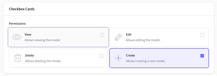
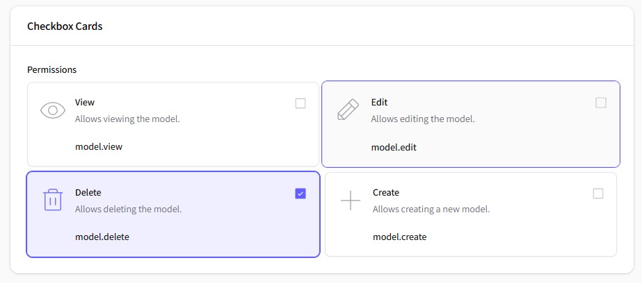
use ToneGabes\BetterOptions\Forms\Components\CheckboxCards;
use ToneGabes\Filament\Icons\Enums\Phosphor;

// Checkbox Cards with default features
CheckboxCards::make('permissions')
    ->label('Permissions')
    ->columns(2)
    ->options([
        'view'   => 'View',
        'edit'   => 'Edit',
        'delete' => 'Delete',
        'create' => 'Create',
    ])
    ->descriptions([
        'view'   => 'Allows viewing the model.',
        'edit'   => 'Allows editing the model.',
        'delete' => 'Allows deleting the model.',
        'create' => 'Allows creating a new model.',
    ])
    ->icons([
        'view'   => Phosphor::Eye->thin(),
        'edit'   => Phosphor::Pencil->thin(),
        'delete' => Phosphor::Trash->thin(),
        'create' => Phosphor::Plus->thin(),
    ])
,
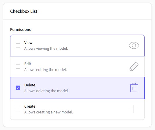
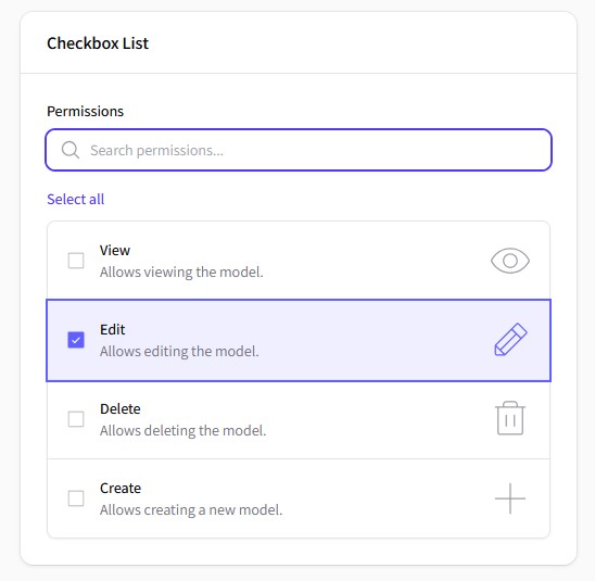
use ToneGabes\BetterOptions\Forms\Components\CheckboxList;
use ToneGabes\Filament\Icons\Enums\Phosphor;

// Checkbox List with default features
CheckboxList::make('permissions')
    ->label('Permissions')
    ->options([
        'view'   => 'View',
        'edit'   => 'Edit',
        'delete' => 'Delete',
        'create' => 'Create',
    ])
    ->descriptions([
        'view'   => 'Allows viewing the model.',
        'edit'   => 'Allows editing the model.',
        'delete' => 'Allows deleting the model.',
        'create' => 'Allows creating a new model.',
    ])
    ->icons([
        'view'   => Phosphor::Eye->thin(),
        'edit'   => Phosphor::Pencil->thin(),
        'delete' => Phosphor::Trash->thin(),
        'create' => Phosphor::Plus->thin(),
    ])
,
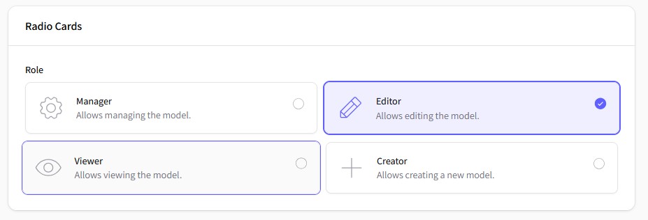
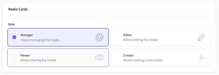
use ToneGabes\BetterOptions\Forms\Components\RadioCards;
use ToneGabes\Filament\Icons\Enums\Phosphor;

// Radio Cards with default features
RadioCards::make('role')
    ->label('Role')
    ->columns(2)
    ->options([
        'manager' => 'Manager',
        'editor'  => 'Editor',
        'viewer'  => 'Viewer',
        'creator' => 'Creator',
    ])
    ->descriptions([
        'manager' => 'Allows managing the model.',
        'editor'  => 'Allows editing the model.',
        'viewer'  => 'Allows viewing the model.',
        'creator' => 'Allows creating a new model.',
    ])
    ->icons([
        'manager' => Phosphor::Gear->thin(),
        'editor'  => Phosphor::Pencil->thin(),
        'viewer'  => Phosphor::Eye->thin(),
        'creator' => Phosphor::Plus->thin(),
    ])
,
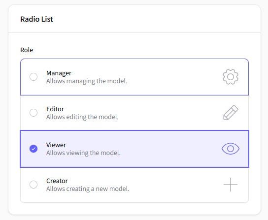
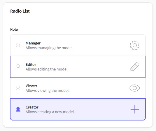
use ToneGabes\BetterOptions\Forms\Components\RadioList;
use ToneGabes\Filament\Icons\Enums\Phosphor;

// Radio List with default features
RadioList::make('role')
    ->label('Role')
    ->options([
        'manager' => 'Manager',
        'editor'  => 'Editor',
        'viewer'  => 'Viewer',
        'creator' => 'Creator',
    ])
    ->descriptions([
        'manager' => 'Allows managing the model.',
        'editor'  => 'Allows editing the model.',
        'viewer'  => 'Allows viewing the model.',
        'creator' => 'Allows creating a new model.',
    ])
    ->icons([
        'manager' => Phosphor::Gear->thin(),
        'editor'  => Phosphor::Pencil->thin(),
        'viewer'  => Phosphor::Eye->thin(),
        'creator' => Phosphor::Plus->thin(),
    ])
,
Using Enums
This package provides a convenient way to use PHP enums for defining options, descriptions, and icons. Here's how you can leverage enums in your component definitions:
use Filament\Support\Contracts\HasDescription;
use Filament\Support\Contracts\HasIcon;
use Filament\Support\Contracts\HasLabel;
use ToneGabes\BetterOptions\Contracts\HasExtraText;
use ToneGabes\Filament\Icons\Enums\Phosphor;

enum Roles: string implements HasDescription, HasExtraText, HasIcon, HasLabel {
    case Manager = 'manager';
    case Editor = 'editor';
    case Viewer = 'viewer';
    case Creator = 'creator';

    public function getDescription(): string {
        return match($this) {
            self::Manager => 'Allows managing the model.',
            self::Editor  => 'Allows editing the model.',
            self::Viewer  => 'Allows viewing the model.',
            self::Creator => 'Allows creating a new model.',
        };
    }

    public function getExtraText(): string {
        return match($this) {
            self::Manager => 'model.manager',
            self::Editor  => 'model.editor',
            self::Viewer  => 'model.viewer',
            self::Creator => 'model.creator',
        };
    }

    public function getIcon(): string {
        return match($this) {
            self::Manager => Phosphor::Gear->thin(),
            self::Editor  => Phosphor::Pencil->thin(),
            self::Viewer  => Phosphor::Eye->thin(),
            self::Creator => Phosphor::Plus->thin(),
        };
    }

    public function getLabel(): string {
        return match($this) {
            self::Manager => 'Manager',
            self::Editor  => 'Editor',
            self::Viewer  => 'Viewer',
            self::Creator => 'Creator',
        };
    }
}
Passing a Backend Enum automatically maps the enum cases to the component options, descriptions, icons, and extra texts.
RadioList::make('role')
    ->label('Role')
    ->enum(Roles::cases())

    //  No need to specify these if enum is using filament enum contracts
    // ->descriptions()
    // ->icons()
    // ->extraTexts()
,
You can hide the descriptions, icons, and extra texts if you don't need them.
RadioList::make('role')
    ->enum(Roles::class)
    ->hiddenDescriptions()
    ->hiddenIcons()
    ->hiddenExtraTexts()
,

// Accepts Closures
RadioList::make('role')
    ->enum(Roles::class)
    ->hiddenDescription(fn () => false)
    ->hiddenIcon(fn () => false)
    ->hiddenExtraText(fn () => false)
,
Advanced Features
Search and Bulk Operations
CheckboxList::make('permissions')
    ->label('Permissions')
    ->enum(Permissions::class)
    ->searchable()
    ->searchPrompt('Search permissions...')
    ->bulkToggleable()
,
Custom Positioning and Visibility
RadioCards::make('role')
    ->label('Role')
    ->columns(2)
    ->enum(Roles::class)
    ->partiallyHiddenIndicator()
    ->itemsCenter()
    ->iconAfter()
    ->indicatorBefore()

    // ->hiddenIndicator() // You also can totaly hide the indicator
,
Icons and Indicators
RadioList::make('role')
    ->label('Role')
    ->enum(Roles::class)
    ->idleIndicator(Phosphor::User->thin())
    ->selectedIndicator(Phosphor::User->fill())
,
Extra Texts/Values
CheckboxCards::make('permissions')
    ->label('Permissions')
    ->columns(2)
    ->enum(Permissions::class)
    ->extraTexts([
        'view'   => 'model.view',
        'edit'   => 'model.edit',
        'delete' => 'model.delete',
        'create' => 'model.create',
    ])
,
RadioCard::make('storage')
    ->enum(Storages::class)
    ->hiddenIcon()
    ->partiallyHiddenIndicator()
    ->idleIndicator(Phosphor::HardDrives->thin())
    ->selectedIndicator(Phosphor::HardDrives->fill())
Pre-defined Themes
// Modern Theme - Icons before, indicators after, centered
CheckboxCards::make('options')
    ->options($options)
    ->theme('modern');

// Minimal Theme - Subtle indicators
CheckboxCards::make('options')
    ->options($options)
    ->theme('minimal');

// Classic Theme - Traditional layout
CheckboxCards::make('options')
    ->options($options)
    ->theme('classic');
Available Components
| Component | Description | Features |
|---|---|---|
CheckboxList |
Vertical list of checkboxes | Search, Bulk toggle, Icons |
CheckboxCards |
Grid of checkbox cards | All list features + Columns, Centering |
RadioList |
Vertical list of radio buttons | Extends native Radio, icons, custom indicators |
RadioCards |
Grid of radio button cards | All list features + Columns, Centering, Themes |
Color by enum
Every component supports a per-option color. When the associated enum implements
Filament\Support\Contracts\HasColor, each case's getColor() is used automatically
to tint its option:
use ToneGabes\BetterOptions\Forms\Components\CheckboxCards;

CheckboxCards::make('roles')
    ->options(RolesEnum::class);
You can also provide colors explicitly, bypassing the enum contract:
CheckboxList::make('priority')
    ->options(['low' => 'Low', 'high' => 'High'])
    ->optionColors([
        'low'  => 'gray',
        'high' => 'danger',
    ]);
Component Methods
Common Methods (All Components)
// Content
->options(array $options)
->descriptions(array $descriptions)
->extraTexts(array $extraTexts)
->hiddenDescription(bool|Closure $condition = true)
->hiddenExtraText(bool|Closure $condition = true)

// Icons and Indicators
->icons(array $icons)
->iconBefore()
->iconAfter()
->hiddenIcon(bool|Closure $condition = true)
->idleIndicator(string $icon)
->selectedIndicator(string $icon)
->indicatorBefore()
->indicatorAfter()
->hiddenIndicator(bool|Closure $condition = true)
->partiallyHiddenIndicator(bool|Closure $condition = true)
Checkbox-Specific Methods
// Search functionality
->searchable(bool $condition = true)
->searchPrompt(string $prompt)

// Bulk operations
->bulkToggleable(bool $condition = true)
->selectAllAction(Action $action)
->deselectAllAction(Action $action)
Card-Specific Methods
// Layout
->columns(int|array $columns)
->itemsCenter(bool|Closure $condition = true)
Styling and Themes
The package uses Tailwind CSS classes and supports Filament's theming system. Main CSS classes:
/* Component containers */
.fi-fo-checkbox-list
.fi-fo-checkbox-card
.fi-fo-radio-list

/* Individual options */
.fi-fo-checkbox-option
.fi-fo-radio-item

/* Content elements */
.fi-fo-checkbox-option__label
.fi-fo-checkbox-option__description
.fi-fo-checkbox-option__extra
.fi-fo-checkbox-option__icon
.fi-fo-checkbox-option__indicator

/* State classes */
.is-selected
.is-centered
.is-indicator-partially-hidden
.is-indicator-partially-hidden
Credits
License
The MIT License (MIT). Please see License File for more information.
Made with ❤️ by Tone Gabes