kiwi / contao-bootstrap
This Contao bundle implements the possibility to assign bootstrap (css-framework) grid classes to contents and therefore flexibly align them via the CMS.
Maintainers
Package info
github.com/KIWI-Werbeagentur/contao-bootstrap-bundle
Type:contao-bundle
pkg:composer/kiwi/contao-bootstrap
Requires
- php: ^8.3.11
- contao/core-bundle: ^5.3
- kiwi/contao-responsive-base: ^1.0 || dev-main
- twbs/bootstrap: ~5.2.3
Requires (Dev)
- contao/manager-plugin: ^2.0
Suggests
- kiwi/contao-blueprints: Simplifies content creation with bootstrap settings for editors
- kiwi/contao-designer: Manage bootstrap design settings via klickibunti in the CMS
Conflicts
- contao/manager-plugin: <2.0 || >=3.0
- kiwi/contao-wrapper-bundle: <1.0.0
This package is auto-updated.
Last update: 2026-07-15 08:17:17 UTC
README
Implement the Bootstrap CSS framework into your Contao CMS.
Table of contents
Scope
This bundle allows you to define bootstrap layout properties within your Contao backend.
Define container widths and flex properties for wrapping elements:
- articles (tl_article)
- element groups (tl_content)
- fieldsets (tl_form_field)
- forms (tl_form)
- sections (tl_layout)
Set colspans and flex properties for components:
- content elements (tl_content)
- form fields (tl_form_field)
- modules and their list items (tl_module)
Create responsive fields yourself by using the integrated ResponsiveWidget or OptionalResponsiveWidget.
Setup
Installation
Install the bundle via composer
composer require kiwi/contao-bootstrap
Implementation
Go to themes (/contao?do=themes) and create or edit a theme. Choose those bootstrap components that shall be loaded or chose none to load all – in any case you need to restore the theme so that some theme files can be generated.
Afterwards you go to layouts (/contao?do=themes&table=tl_layout&id={{theme_id}}) and create or edit one. Apply container widths to row sections (header, footer), custom sections (by choosing a correspondig template) and sidebars (main area will fill available space). If you don't want to manually load Bootstrap you can activate automatic loading in your CSS-framework selection (recommended).
CSS-Classes and their styles will now be applied, when you define bootstrap layout properties in your contents (forms, modules, articles & content elements)
Step 3: Use in articles, content element_groups and modules listing elements
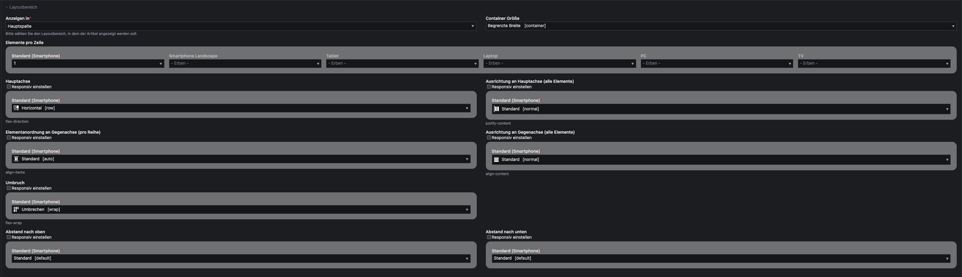
Articles are used as bootstrap containers.
- Container Width: You can choose between container-fluid (whole viewport) and limited width upwards a specifix breakpoint.
- Elements per row: Defines how many content elements will be shown in one row.
- Direction [flex-diretion]: Define block (vertical and horizontal) and inline alignment.
- Alignment [justify-content, align-content, align-items]: Define block (vertical and horizontal) and inline alignment.
- Wrapping [flex-wrap]: Allow or disallow row breaks.
- Spacing [padding-top, padding-bottom]: Choose how much distance an article should have to its previous and next sibling (Take a look at the spacing section for further information).

To define further content elements as wrapper, you can add an entry to $GLOBALS['responsive']['tl_content']['includePalettes']['container'] within your config file.
To define further modules as wrapper, you can add an entry to $GLOBALS['responsive']['tl_module']['includePalettes']['container'] within your config file.
Step 4: Use in content elements, form fields and modules
- Overwrite Width: Check to overwrite "Elements per row" setting of parent element.
- Width: Set elements width.
- Offset: Define the positioning of the element.
- Order: Change the order of an element.
- Alignment: Overwrite "Alignment" setting of parent element.


To remove the settings from a specific content element, add an entry to $GLOBALS['responsive']['tl_content']['excludePalettes']['column'] within your config file.
To remove the settings from a specific module, add an entry to $GLOBALS['responsive']['tl_module']['excludePalettes']['column'] within your config file.
To remove the settings from a specific form field, add an entry to $GLOBALS['responsive']['tl_form_field']['excludePalettes']['column'] within your config file.
Vertical spacings
For simple customization, you can overwrite the following variables in you (s)css file
:root {
  --spacing-default: your_size;
  --spacing-none: your_size; /* "0" recommended */
  --spacing-gap: your_size; /* grid gutter width recommended */
  --spacing-gap-half: your_size; /* half of grid gutter width recommended */
  --spacing-xxs: your_size;
  --spacing-xs: your_size;
  --spacing-sm: your_size;
  --spacing-md: your_size;
  --spacing-lg: your_size;
  --spacing-xl: your_size;
  --spacing-xxl: your_size;
}
To add custom spacing options, add the css variables in your own (s)css file. Additionally, you need to extend the BootstrapConfiguration class and modify the $arrSpacings property accordingly, and provide labels for the new options.
:root {
    --spacing-foo: your_size;
    --spacing-bar: your_size;
}
// /src/CustomBootstrapConfiguration.php
namespace App;

use Kiwi\Contao\BootstrapBundle\Configuration\BootstrapConfiguration;

class CustomBootstrapConfiguration extends BootstrapConfiguration
{
    public function __construct($objDca = null)
    {
        parent::__construct($objDca);

        $this->arrSpacings['foo'] = 'p{{direction}}{{modifier}}-foo';
        $this->arrSpacings['bar'] = 'p{{direction}}{{modifier}}-bar';
    }
}
// /contao/languages/en/responsive.php
$GLOBALS['TL_LANG']['responsive']['spacings']['foo'][0] = "Foo-sized [foo]";
$GLOBALS['TL_LANG']['responsive']['spacings']['bar'][0] = "Bar-sized [bar]";
Widgets
There a different types of responsive widgets allowing you to adjust a setting for different viewports (Values will be inherited from smaller to bigger device). When using them, define the input type that shall be replicated as 'responsiveInputType'.
Fully Responsive Widget [responsive]
Directly shows a setting for every viewport

Example usage:
$GLOBALS['TL_DCA'][{your table}]['fields'][{your first field}}] = [
    'inputType' => 'responsive',
    'responsiveInputType' => 'select',
    'options_callback' => [{your first options}, {your second option}}],
    'sql' => "blob NULL"
];
Optionally Responsive Widget [optionalResponsive]
Only shows a global setting but can be set responsively by activating the checkbox.

Example usage:
$GLOBALS['TL_DCA'][{your table}]['fields'][{your second field}}] = [
    'inputType' => 'optionalResponsive',
    'responsiveInputType' => 'text',
    'sql' => "blob NULL"
];