craftpulse / craft-colour-swatches
Let clients choose from a predefined set of colours and utilise associated colour codes and class names in your templates.
Package info
github.com/craftpulse/craft-colour-swatches
Type:craft-plugin
pkg:composer/craftpulse/craft-colour-swatches
Requires
- php: ^8.0.2
- craftcms/cms: ^5.0.0
Requires (Dev)
- craftcms/cms: ^5.0.0
- craftcms/phpstan: dev-main
- craftcms/rector: dev-main
- v5.x-dev
- 5.1.0
- 5.0.3
- 5.0.2
- 5.0.1
- 5.0.0
- v4.x-dev
- 4.5.3
- 4.5.2
- 4.5.1
- 4.4.0
- 4.3.0
- 4.2.1
- 4.2.0.1
- 4.2.0
- 4.1.0
- 4.0.5
- 4.0.4
- 4.0.3
- 4.0.2
- 4.0.1
- 4.0.0
- 4.0.0-RC2
- 4.0.0-RC1
- 4.0.0-beta.2
- 4.0.0-beta.1
- v3.x-dev
- 1.7.0
- 1.6.0
- 1.5.2
- 1.5.1
- 1.5.0.4
- 1.5.0.3
- 1.5.0
- 1.5.0-RC.1
- 1.4.2.1
- 1.4.2
- 1.4.1.1
- 1.4.1
- 1.4.0
- 1.3.3
- 1.3.2.1
- 1.3.1
- 1.3.0
- 1.2.9
- 1.2.8
- 1.2.7
- 1.2.6
- 1.2.5
- 1.2.4
- 1.2.3
- 1.2.2
- 1.2.1
- 1.2.0
- 1.1.4
- 1.1.3
- 1.1.2
- 1.1.1
- 1.1.0
- 1.0.6
- 1.0.5
- 1.0.4
- 1.0.3
- 1.0.2
- 1.0.1
- 1.0.0
- dev-v5-develop
- dev-v4-develop
- dev-dependabot/composer/craftcms/cms-4.4.6.1
- dev-dependabot/composer/guzzlehttp/psr7-2.5.0
- dev-renovate/configure
- dev-feature/ui-v4
- dev-feature/ui
- dev-release/4.0.0-RC1
- dev-release/4.0.0-beta.2
- dev-master
- dev-feature/vite
- dev-release/1.5.0
- dev-develop
- dev-release/1.4.1
- dev-release/1.4.0
- dev-bugfix/1.3.2.1
- dev-feature/color-config-arrays
This package is auto-updated.
Last update: 2026-04-13 19:22:01 UTC
README
Create custom colour palettes with flexibility & control.
Colour Swatches plugin for Craft CMS 4+
Instead of providing a user a full color picker, Colour Swatches is a configurable a fieldtype that gives an admin the ability to provide a selection of colours for a user to choose from. This allows you to create branded colour palettes with a bank of classnames ready to use in your templates.
Requirements
This plugin requires Craft CMS 4.0.0 or later.
Installation
To install the plugin, follow these instructions.
-
Open your terminal and go to your Craft project:
cd /path/to/project -
Then tell Composer to load the plugin:
composer require craftpulse/craft-colour-swatches -
In the Control Panel, go to Settings → Plugins and click the "Install" button for Colour Swatches.
Configuring Colour Swatches
Using the field settings
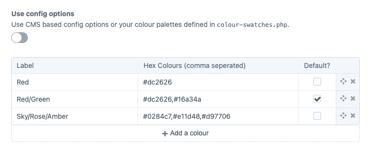
Create a Colour Swatches field and provide label and hex value options. Multiple colours are possible by seperating them with a comma.
When using Colour Swatches with the field settings
You can access both the label and color in your template. By default, the label will display:
    {{ fieldName }}
    {{ fieldName.label }}
    {{ fieldName.color }}
    {% for color in fieldName.color %}
        {{ color.color }}
    {% endfor %}
If you want more granular control with your colour palettes, use the configuration file option below.
Using the config file
You can use a config/colour-swatches.php config file file to predefine the possible colours, define different palettes and add lables, classnames or other attributes to your colours.
Take a look at the config file in this repo for an example.
return [

    // Custom  palettes, fixed options [label, default (boolean), colour (array(colour, customOptions)) ]
    'palettes' => [
        'Tailwind' => [  // custom label (required)
            [
                'label'   => 'Red', // custom label (required)
                'default' => true,  // default could be true/false (option is required)
                'color'   =>  [
                    [
                        'color'             => '#ef4444',               // the colour shown in the fieldtype (required)
                        'background'        => 'bg-red-500',            // optional / custom attribute
                        'backgroundHover'   => 'hover:bg-red-700',      // optional / custom attribute
                        'text'              => 'text-white',            // optional / custom attribute
                        'textHover'         => 'hover:text-zinc-200'    // optional / custom attribute
                    ]
                ]
            ],
            [
                'label'   => 'Amber',
                'default' => false,
                'color'   =>  [
                    [
                        'color'             => '#f59e0b',
                        'background'        => 'bg-amber-500',
                        'backgroundHover'   => 'hover:bg-amber-700',
                        'text'              => 'text-white',
                        'textHover'         => 'hover:text-zinc-200'
                    ]
                ]
            ],
            [
                'label'   => 'Green',
                'default' => false,
                'color'   =>  [
                    [
                        'color'             => '#22c55e',
                        'background'        => 'bg-green-500',
                        'backgroundHover'   => 'hover:bg-green-700',
                        'text'              => 'text-white',
                        'textHover'         => 'hover:text-zinc-200'
                    ]
                ]
            ],
            [
                'label'   => 'Blue',
                'default' => false,
                'color'   =>  [
                    [
                        'color'             => '#3b82f6',
                        'background'        => 'bg-blue-500',
                        'backgroundHover'   => 'hover:bg-blue-700',
                        'text'              => 'text-white',
                        'textHover'         => 'hover:text-zinc-200'
                    ]
                ]
            ],
            [
                'label'   => 'Purple',
                'default' => false,
                'color'   =>  [
                    [
                        'color'             => '#a855f7',
                        'background'        => 'bg-purple-500',
                        'backgroundHover'   => 'hover:bg-purple-700',
                        'text'              => 'text-white',
                        'textHover'         => 'hover:text-zinc-200'
                    ]
                ]
            ],
            [
                'label'   => 'Yellow/Emerald',
                'default' => false,
                'color'   =>  [
                    [
                        'color'             => '#eab308',
                        'background'        => 'bg-yellow-500',
                        'backgroundHover'   => 'hover:bg-yellow-700',
                        'text'              => 'text-white',
                        'textHover'         => 'hover:text-zinc-200'
                    ],
                    [
                        'color'             => '#059669',
                        'background'        => 'bg-emerald-600',
                        'backgroundHover'   => 'hover:bg-emerald-800',
                        'text'              => 'text-white',
                        'textHover'         => 'hover:text-zinc-200'
                    ]
                ]
            ],
            [
                'label'   => 'Red/Amber',
                'default' => false,
                'color'   =>  [
                    [
                        'color'             => '#a855f7',
                        'background'        => 'bg-red-500',
                        'backgroundHover'   => 'hover:bg-red-700',
                        'text'              => 'text-white',
                        'textHover'         => 'hover:text-zinc-200'
                    ],
                    [
                        'color'             => '#f59e0b',
                        'background'        => 'bg-amber-500',
                        'backgroundHover'   => 'hover:bg-amber-700',
                        'text'              => 'text-white',
                        'textHover'         => 'hover:text-zinc-200'
                    ]
                ]
            ],
            [
                'label'   => 'Sky/Rose',
                'default' => false,
                'color'   =>  [
                    [
                        'color'             => '#0ea5e9',
                        'background'        => 'bg-sky-500',
                        'backgroundHover'   => 'hover:bg-sky-700',
                        'text'              => 'text-white',
                        'textHover'         => 'hover:text-zinc-200'
                    ],
                    [
                        'color'             => '#e11d48',
                        'background'        => 'bg-rose-600',
                        'backgroundHover'   => 'hover:bg-rose-800',
                        'text'              => 'text-white',
                        'textHover'         => 'hover:text-zinc-200'
                    ]
                ]
            ],
        ]
    ]

];
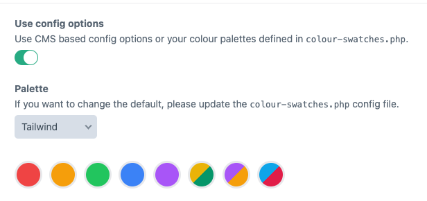
In your field settings you can then have the possibility to have it use the predefined colours.
Making changes to your config file
If have entries using Colour Swatches and you make changes to your config file, you will need to resave your entries for new information from your config file to be pulled into your entry data.
From the command line you can run Crafts ./craft resave/entries and your entries will be populated with any changes to from your colour-swatches.php config file.
Note: As of version 5.2.0, Colour Swatches uses a silent handle system for stability. When you first save entries, a handle is automatically generated from the label (e.g., "Red" becomes "red"). This handle is used to match colours even if you change the label later.
Using Colour Swatches
You can access both the label and color in your template. By default, the label will display:
    {{ fieldName }}
    {{ fieldName.label }}
    {{ fieldName.color }}
    {{ fieldName.customAttribute }}
If you're using multiple colours you will need to loop through your color array
    {% for field in fieldName.color %}
        {{ field.color }}
        {{ field.customAttribute }}
    {% endfor %}
Using Collections
The collection() method (added in v5.1.0) returns a recursive Laravel collection for easier manipulation:
{# Get all hex values as an array #}
{% set hexValues = fieldName.collection().pluck('color').all() %}

{# Filter colors by a custom attribute #}
{% set darkColors = fieldName.collection()
    .filter(c => c.background is defined and 'dark' in c.background) %}

{# Map to custom format #}
{% set cssVars = fieldName.collection()
    .map(c => '--color: ' ~ c.color ~ ';')
    .implode(' ') %}

{# Chain multiple operations #}
{% set backgrounds = fieldName.collection()
    .pluck('background')
    .filter()
    .unique()
    .all()
%}

{# Get count of colors #}
{% set colorCount = fieldName.collection().count() %}

{# Create CSS gradient from colors #}
{% set gradient = 'linear-gradient(' ~ fieldName.collection().pluck('color').implode(', ') ~ ')' %}
<div style="background: {{ gradient }}">Gradient background</div>
Changing Labels
By default, colour options are identified by their labels. The plugin now uses a silent handle system to maintain stability.
How Handles Work
When an entry is saved, a handle is automatically generated from the label and stored in the database:
- "Red" → handle: "red"
- "Primary Red" → handle: "primary-red"
- "Sky Blue" → handle: "sky-blue"
This handle is stored silently and never exposed in your templates.
Safe Label Changes
Option 1: Add explicit handles (Recommended)
Add a handle field to your config before changing labels:
'palettes' => [
    'Tailwind' => [
        [
            'handle' => 'red',        // Add this once - keeps it stable
            'label' => 'Red',         // Can be changed freely after handle is set
            'color' => [['color' => '#ef4444']]
        ]
    ]
]
Workflow:
- Add
handleto your config entries - Run
./craft resave/entriesonce to store handles - Now you can change
labelvalues without breaking existing entries
Option 2: Without explicit handles
If you don't add explicit handles, the system auto-generates them from labels. To change a label:
- Change the label in your config
- Run
./craft resave/entriesto update all entries
Handle Priority
The system uses this priority for handles:
- Explicit handle in config → Always used if present (allows intentional handle changes)
- Existing handle in database → Preserved for stability
- Auto-generated from label → Created on first save
This means you have full control: use auto-generation for simplicity, or add explicit handles when you need guaranteed stability.
GraphQL
Colour Swatches comes with GraphQL support you can build a query as follows:
fieldName {
        label
        class
        color
      }
which will give you the following result if you use the config file:
"fieldName": {
          "label": "Black/White",
          "class": "",
          "color": [
            "{\"color\":\"#000000\",\"background\":\"bg-black\"}",
            "{\"color\":\"#ffffff\",\"text\":\"text-white\"}"
          ]
        },
or in case of a single value added through the settings you will see:
"fieldName": {
          "label": "Black",
          "class": "",
          "color": [
            "#000000"
          ]
        },
Brought to you by Craft Pulse


